As the curation process was an important part of this show, the name of the person selecting the work was overprinted on the name of the artist. Red transparent film attached with static on top of the text conceals the selectors' names, but viewers could move the film to reveal the names.


3 posters where text flows from one to the next.

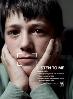
Printing on an existing poster

Undergraduate Senior Project Exhibition 2008
Gallery signage and posters for the undergraduate senior projects show at Yale: The show consisted with the works of graduating students from four departments, panting and printmaking, sculpture, graphic design and photography. Each disc with four colors were attached onto a motor and individually controlled by a motion detector.


This project played up the basic purpose of gallery signage: to invite people into the space. While most signage is designed to be seen head-on and from outside the gallery space, this signage was distorted and illegible from that vantage point. As viewers shifted perspective, they realized there were two spots inside the gallery from which each text appeared undistorted. Instead of presenting the information to a static viewer, this optical game encouraged people to come into the gallery space and move around the signage in pursuit of perceptual secrets.
Poster announcing a postage stamp design workshop given by visiting designer Jessica Helfand. The poster doesn’t state that the workshop is about designing postage stamps. Instead it makes reference to the process of producing a postage stamp in all elements of the poster. A custom perforation typeface was created and the main information was laser cut through each poster.
Projection with added elements


Book printed on vellum where each page makes up a 3D relief of a face.

Printed plastic. All that is white is completely see through.


A projection onto a person sitting by a wall, photographed and overlayed with text in the post editing process.

Text over image...in this case, words in and out... I thought it was interesting to overlay words 'in' and 'out' in different windows... as if one is an entrance and other is an exit... or you look into one and look out of the other one... i don't know, it made me think and that's a good thing.

Same phrase, but than the arrangement of the letters changes... the meaning changes completely.

I always found neon lights very intriguing...

Wall projection that adds perspective to the room

Looks like a bar chart that is an installation in the same time... thought it was interesting
Foot prints on sand with writing in them...


 Printed plastic. All that is white is completely see through.
  A projection onto a person sitting by a wall, photographed and overlayed with text in the post editing process.
  Wall projection that adds perspective to the room
  Looks like a bar chart that is an installation in the same time... thought it was interesting


 Packaging something in an untraditional container?


 Done by Barbara Krueger for opening of the new branch of Whitney Museum in downtown.


 Done by Poulin+Morris. Promotional posters.
 Done by 2x4 for Cooper-Hewitt


